01 / Decorative flake
Light neutrals
Soft ivory, limestone, and pale gray keep the room bright.

FINISHES
The examples below are popular starting points—not the full catalog. KW can work toward many more color combinations based on the space, available coating system, and final sample selection.
POPULAR DIRECTIONS
A grounded mid-tone direction that works easily with the materials around it.
MORE COLOR DIRECTIONS
From soft neutrals and bold decorative flake to rich metallic color and one-of-a-kind marbling, the finish should feel like it belongs in your space.
Soft ivory, limestone, and pale gray keep the room bright.
Sand, taupe, and warm earth tones with natural depth.
Versatile concrete grays layered with quiet contrast.
Dark graphite and black for a bold architectural finish.
Crisp black, white, and silver with graphic energy.
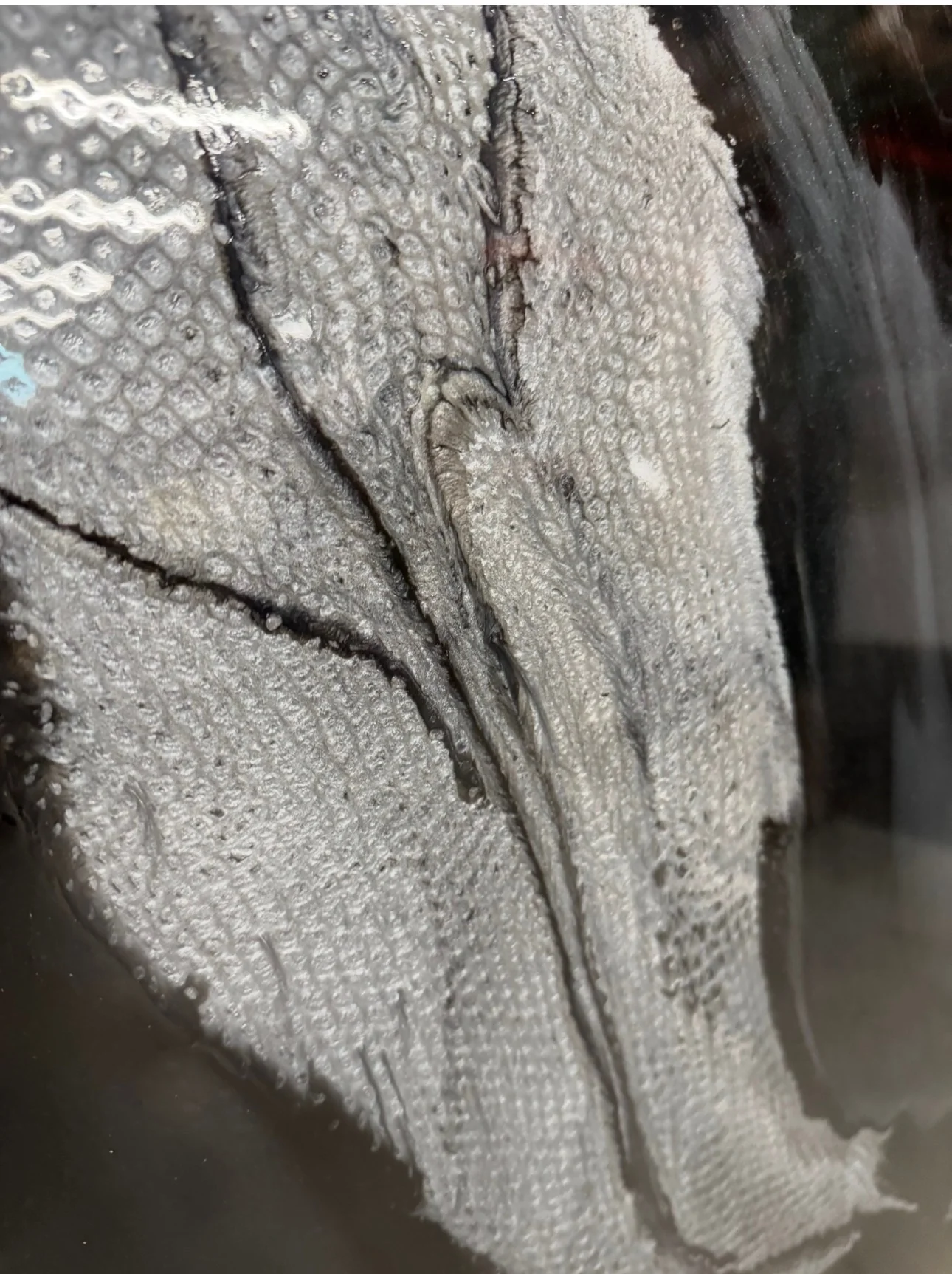
Pearl and silver pigment with flowing, marble-like veining.
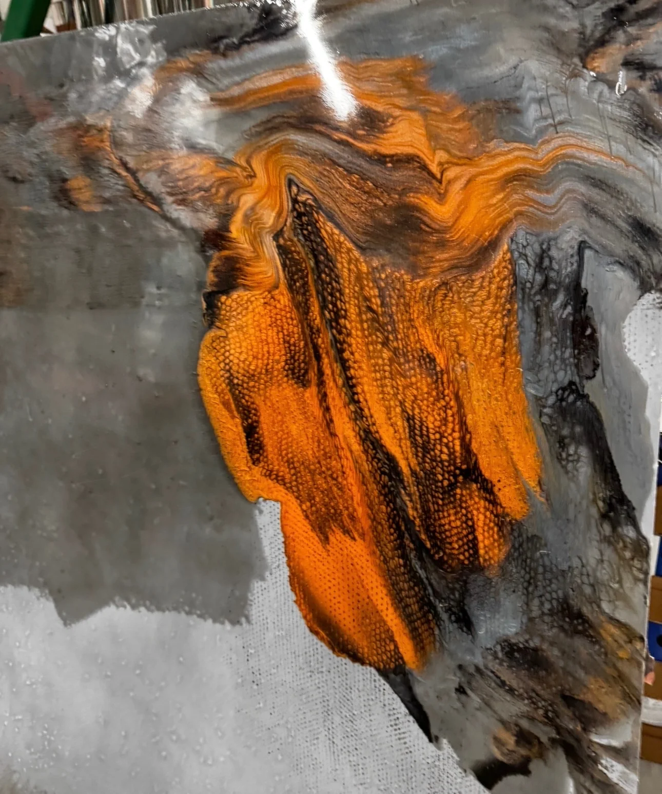
Rich copper moving through charcoal and smoky silver.
Deep ocean blue, warm gold, and layered metallic movement.
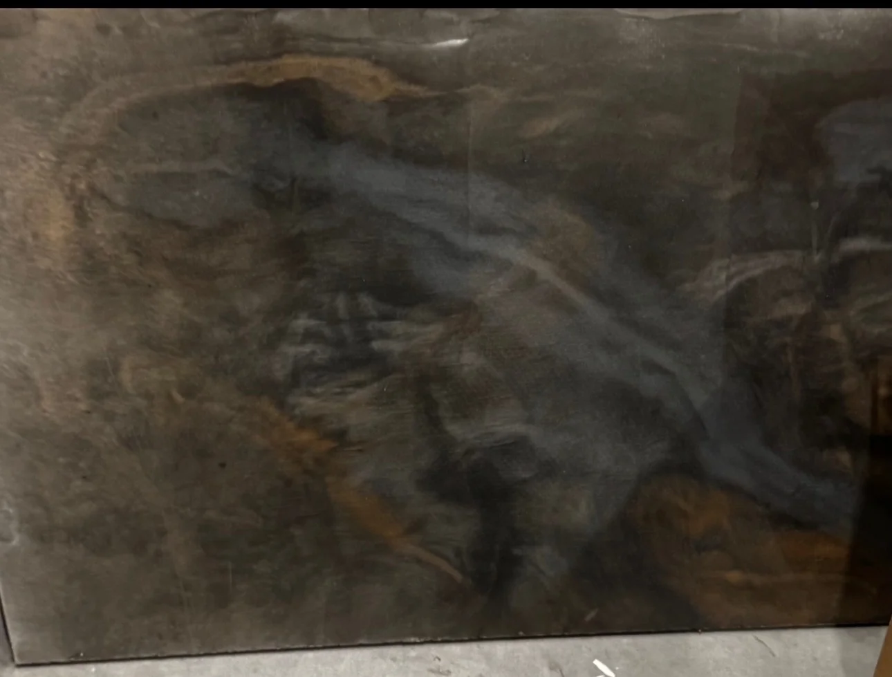
Bronze, bold color, dramatic marbling—or your own blend.
FINAL SELECTION
Screen colors are useful for inspiration, but they are not a substitute for the real material. Final color and texture should be chosen from available physical samples for the coating system recommended for your project.
YOUR SPACE. YOUR FINISH.
Send a few project details and photos. KW will help you understand the best next step and what it may take to bring the project to life.
Start your estimate ↗